
Context
Until now, Chama's website lacked strategic planning,
merely serving as a redirection tool to the app store.
Recognizing the need for a change, we aimed to elevate the
significance of the website and enhance its role in engaging
with the end user.

Performance Issues
While assessing the challenges encountered thus far, we've identified some crucial points:
• Inadequate Google search ranking (seventh place for gas purchase-related queries).
• Lack of specifications on pages for analytics.
• Absence of defined goals or parameters on the current site."
New Objectives
• Attract new consumers and resellers.
• Identify and recruit qualified individuals.
•Boost website traffic, increase app downloads, and enhance gas cylinder sales.
• Establish Chama as a secure and trustworthy platform for gas orders.
The project
Throughout the project, alongside the structural redesign of the website, we concurrently engaged in rebranding efforts. To expedite the process, we collaborated with a third-party company to develop the website layouts, ensuring efficiency without unnecessary delays.
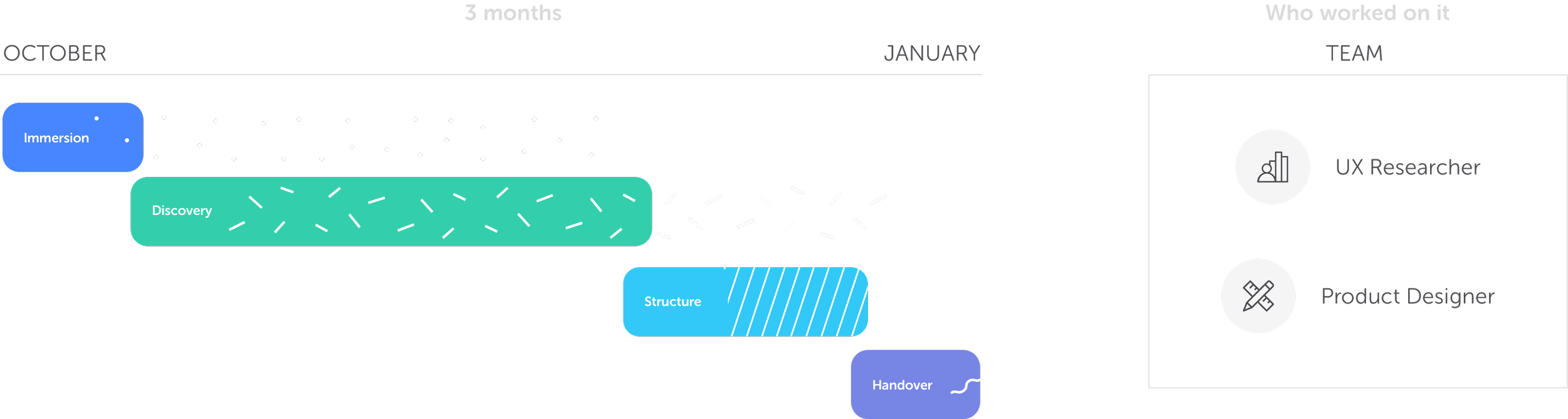
The process
We employed UX cards to streamline the design process in this project, providing enhanced organization and improved visibility for other teams involved.

Personas
During the workshops, we created personas for our three key user groups: the reseller, the consumer, and the candidate (who applies to work at chama office).

User Journey
Following the creation of personas, we crafted the journey for each of them. Here, we present the Reseller's journey.

Key Features
Through the Crazy 8's workshop with the participation of various company representatives, we outlined the main functionalities of the website:
• [Consumer Focus] Video highlighting gas safety precautions.
• [Reseller Focus] Simplified registration.
• [Reseller Focus] ANP validation via API.
• [Candidate Focus] Map displaying the nationalities working at Chama as an attraction.
• [Candidate Focus] Chama Blog.
• [Consumer Focus] Segregated areas for consumers and resellers.

Content Inventory
With the entire website already online, we conducted a comprehensive page-by-page assessment, thoroughly analyzing all available content. Our evaluation encompassed both the content itself and its writing style, with a keen focus on meeting the needs of our users.

Vocabulary
We conducted a vocabulary study to grasp the most common and easily understood words and expressions for our users. Subsequently, we utilized card sorting to aid in organizing the content.

Site Map
After specifying the pages, we delineated the sitemap, outlining the pages
to be made available. This process was accompanied by establishing priorities
and delivery packages.
Conclusion
After implementing the proposed improvements, both in design and performance, as well as in marketing, we observed several notable outcomes:
• Lowered CPC (Cost Per Click).
• Increased the number of app downloads through the store.
• Achieved the top position in searches for gas sales.
• Reduced friction at touchpoints, such as with the Customer Service team.
• Decreased the number of complaints, as many questions were addressed directly on the website.
